Case Study:Lean Space
Designing & developing my personal website in 2015.
· 5 min read
- Case Study
- Design
- Frontend
My Brand as a College Grad
I created Lean Space right after I graduated from college in 2015. The goal of the project was to create a personal brand that would help me land my first full-time engineering job in Silicon Valley. This brand would be applied to my website, resume, and cover letters.
The two key factors directing my project were the following:
- Demonstrate that I’m a self-motivated software engineer that is not solely dependent on 3rd party packages and is capable of developing my own solutions.
- Showcase a unique visual style to distinguish me from engineers who don’t consider design practices, blindly rip templates, or design resumes in LaTeX.
Development
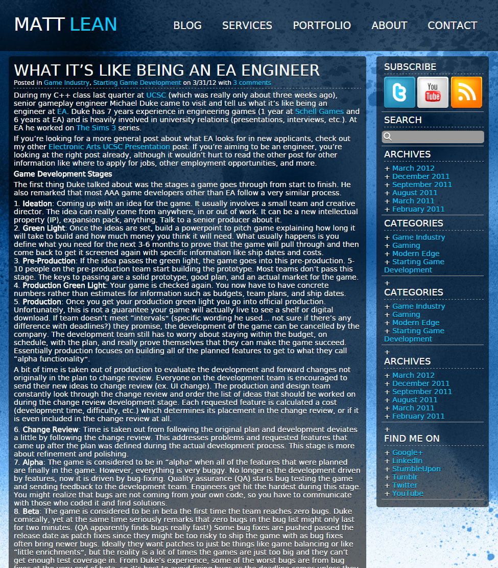
My previous website before this one ran off of WordPress and MySQL with a custom theme I wrote in PHP, HTML, and CSS. This tech stack was used because it was the most popular with my clients back when I was freelancing from 2008 to 2014.
Originally I was developing Lean Space as a theme for another project I was working on, Xuehua CMS, a custom content management system built with Ruby on Rails since I wanted to learn the framework due to its popularity at the time. As the projects progressed, my interest in Xuehua CMS waned as I felt that it was unlikely I would ever use it anywhere besides my site due to my focus on full-time opportunities rather than freelance. If I was only going to use it for my site, the trouble of maintaining it wouldn’t be worth it, so after I felt I had some good exposure to Ruby, I discontinued the project and focused on Lean Space.
Instead of dealing with the hassle of a content management system, I decided to just deploy a backendless static site since it was unlikely that my website would update often. This was before the popularity of static site generators like Jekyll, but given the small scope of the site, I think I would’ve implemented it in the same way, regardless of any trends.
Most of my previous web-related work involved popular frameworks and libraries, as most of them were used when I was the sole developer under deadlines. Since this was a personal project, I wanted to avoid using 3rd party dependencies as much as I could in favor of vanilla JavaScript, CSS, and native browser APIs, just to show that I was comfortable with handling both.
Backendless with SEO-Friendly Seamless Page Transitions
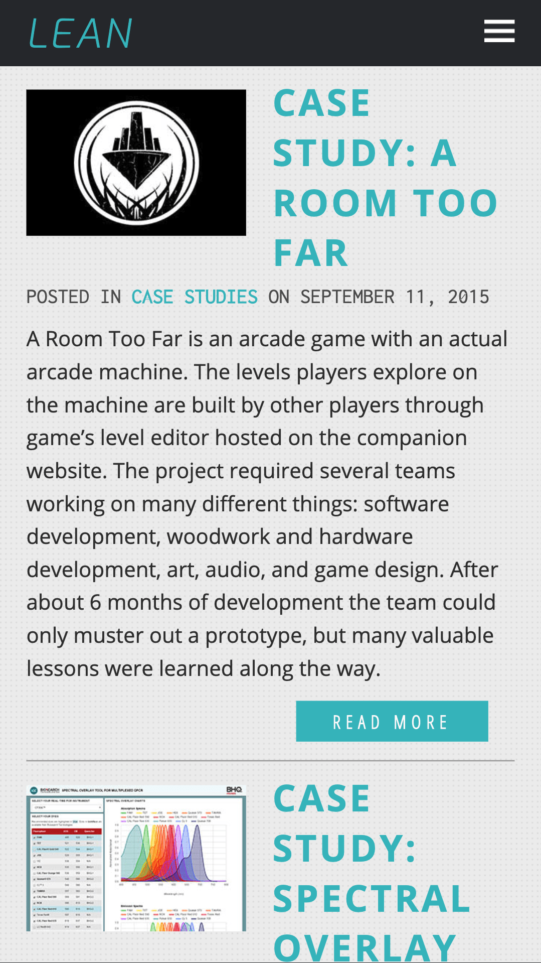
I wanted the site to utilize seamless page transitions without triggering a page reload, an inherent feature of single-page applications (SPAs). However, a common trade-off with this approach at the time was that it could make it difficult for web crawlers to parse your page, negatively impacting search engine optimization (SEO). To address this issue, I structured the server with a standard setup: every page would have a corresponding static HTML document that would be distributed by the server. Once a page is downloaded by a user, JavaScript is executed and adds a click event handler on all internal links that retrieves the next page through an AJAX request, updating the DOM of the current page with its content and thus allowing navigation without a page reload.
This also allows the website to still be fully functional when JavaScript is disabled, avoiding the JavaScript requirement problem for most SPAs. When browsing the site without JavaScript, the page is still completely rendered but the event handler will never be applied, letting the navigation experience fallback to the standard link behavior. This ensures the SEO-friendliness of the website, as web crawlers will be able to easily read an identical page that humans see without needing to execute any JavaScript.
This solution also does not require any backend code, hence the “backendless” aspect. It just lets the server, in my case an Apache server, keep it simple and serve static files.
Custom Lightbox Library
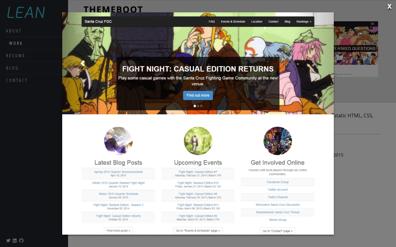
A significant part of the website experience involves looking at screenshots of my portfolio work, so I wrote a lightbox library called Lantern.js. It uses lightweight vanilla JavaScript and CSS, is open source, and can be found on GitHub and npm.
Work Filtering
This was where the main exception to the “no 3rd party dependency rule” was made: the work page. As this would likely be one of the main pages prospective employers would investigate first, I wanted the experience here to be a little more sophisticated by creating a filter feature that faded each work piece in and out. I ended up using Masonry for this.
Design
I wanted the style to feel like one fitting for a software engineer. Nothing too extravagant, but still unique enough to show that I have some experience with design.
Colors
I decided on a blueish-green as my primary color because it was a fairly bright, calming, and inoffensive color. Grey became my secondary color because it was a very neutral color and didn’t compete with the primary colors.
- #3DBBC2
- #54E1E6
- #EEEEEE
- #BABBBD
- #333333
- #292C31
Typography
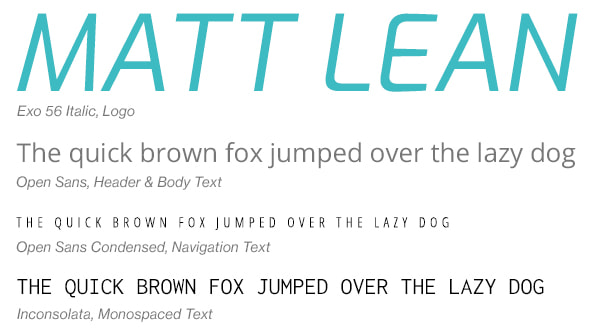
I chose Open Sans for the body and header text because I wanted to use a modern looking sans serif typeface that wasn’t a web-safe standard, just to give a subtly different look to the text.
For the monospaced text, I chose Inconsolata. This would be used for body and heading text that would benefit from monospacing or would need to be distinguished from the text in Open Sans.
For the logo, I settled with Exo since it was a font that contrasted with Open Sans very well while expressing a very technological feel. I specifically used it in italics to make the logo look like it was “leaning” over to a side, a play on my last name (Lean).
To make the typefaces still viewable for users who didn’t have them already installed, I imported them as web fonts through Google Fonts.
Animations & Transitions
I used animations and transitions wherever I could throughout the site to have it give off a sleek and polished experience. This contributed particularly to the navigation experience, making the changing of pages feel smooth and seamless. By only using CSS, the animations can be experienced by users even when they have JavaScript disabled.
Custom Responsive Layout
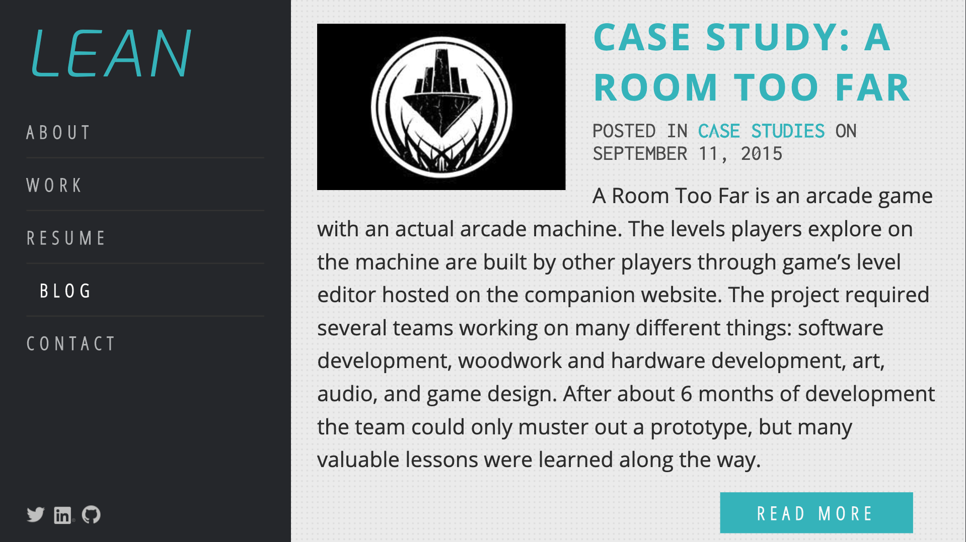
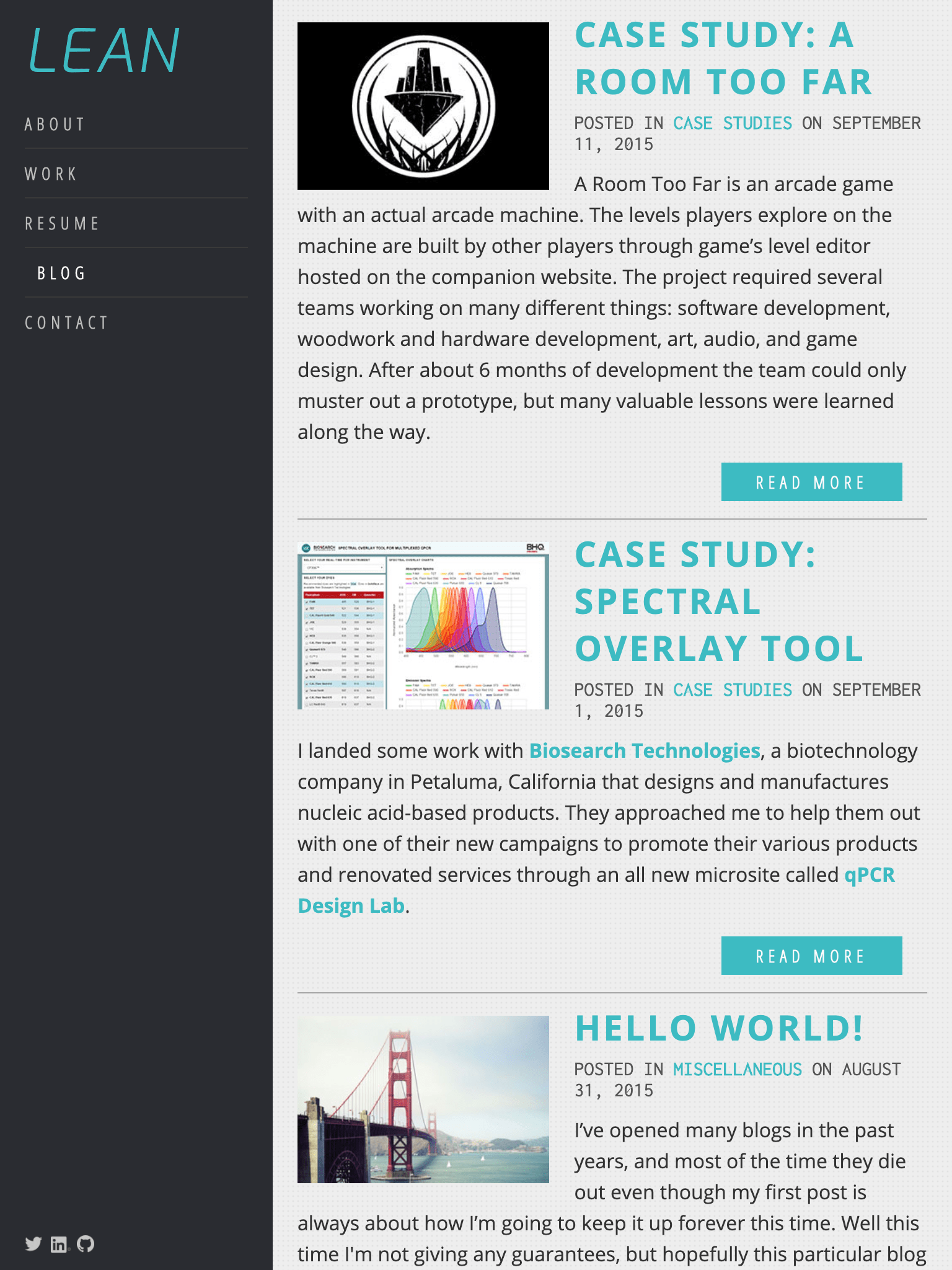
Without the luxury of a framework like Bootstrap, I would need to create my custom layout code that would support both desktop and mobile devices. I ended up implementing the layout with floats and the responsive design with media queries.
