Case Study:MattLean.com
The development process behind my personal website in 2020.
· 30 min read
- Case Study
- Backend
- Design
- Frontend
My website was in serious need of a redesign since it wasn’t updated in almost 5 years. Because of this, I took the opportunity to explore some things that I had been meaning to try out for some time. This post overviews some of the thoughts, opinions, and solutions I had for the more significant challenges of the project.
Note that this case study is focused on the technical side of things. If you want to learn more about the visual designs, another post on that is coming soon!
Full-Stack React, Express, and JavaScript
Choosing a Language & Library
I was debating on taking this opportunity to learn Vue, but I decided to stick with React because there were a few features with the library and packages in the ecosystem that I hadn’t had the chance to play around with yet. I was also interested in using React and Express together on the backend, a setup that I had experimented with for Lean JavaScript Application Starter, but one that I hadn’t released for a production environment yet. Even though my preferred language for the backend was Python, admittedly was it was nice only dealing with only one language when working with both ends of the stack.
TypeScript was only used for eswiss, the design system used for this project, as I see it potentially intertwining with some other future projects where types could be useful. For a smaller project like this one, I think JavaScript does the job fine. Incompatibility between the two languages is not an issue since TypeScript can be compiled into JavaScript with separate declaration files, so the eswiss components can be used on MattLean.com without any hiccups.
Abandoning Classes for Hooks
This project was written exclusively with function components and hooks. Admittedly it did take a bit getting used to, but after giving it some time, I have to say that it did end up producing tidier components through a cleaner development process. Not dealing with some of the more cumbersome aspects of class components, like binding this to class methods or worrying about possibly needing to convert a function component in the future, was a greatly welcome change.
useEffect caused the most problems for me at first. The hook is usually utilized in scenarios where class lifecycle methods were previously necessary, and it’s great that it allows related code to be grouped instead of being scattered across a class component. However, it does come with its own new challenges. useEffect’s role is deceptively straightforward—all it does is run a function after a component renders, but there are a few of nuances behind it that I didn’t know to look out for, causing issues where it ran too frequently, didn’t run enough, or read stale state. Luckily, the React docs have a great explanation of the potential roadblocks for hook newbies like myself.
One downside to using hooks was that I could no longer use React Hot Loader, slowing down the development process a bit. There is a successor called Fast Refresh, but it is currently only stable for React Native, so I settled with webpack-dev-server’s default live reload.
SSR & Hydration with Express & React Router
Back on Lean Space, I wanted to create a website that navigated through pages without reloads. This meant that I would likely need to develop a single-page application (SPA), but I was concerned about the negative impact it would have on search engine optimization (SEO). I opted for an architecture that served static files for every page route and transitioned to an SPA-paradigm after the initial page load. The result was a persistent, refreshless experience that is also SEO-friendly. (If you’re interested in learning more about Lean Space, you can read the case study on it.)
Nowadays there are web crawlers that are much better at processing JavaScript. However, there are still many others that rely on the initially served markup, so I figured it would still be good to use a similar architecture for MattLean.com. The only problem is that this type of approach in combination with React does add a nontrivial amount of complexity, but it’s not too bad to handle since the amount of content for this project is reasonably small and all of it is static.
The architecture for this solution is based on the Node.js, Express, and server-side rendered (SSR) React starter project I built for Lean JS App Starter.
Building the Frontend with webpack
The webpack build process has two separate configurations for frontend and backend. For the backend, a standard one will suffice, so showing it is unnecessary. The frontend on the other hand is close to standard, but does have some changes to get our full-stack setup working that are worth pointing out:
const AssetListWebpackPlugin = require("asset-list-webpack-plugin");
const path = require("path");
const HtmlWebpackPlugin = require("html-webpack-plugin");

module.exports = {
  entry: "./src/frontend/index.jsx",

  output: {
    chunkFilename: "[name].[chunkhash].js",
    filename: "[name].[chunkhash].js",
    path: path.resolve(__dirname, "dist/frontend"),
  },

  module: {
    rules: [
      {
        test: /.jsx?$/,
        exclude: /node_modules/,
        use: {
          loader: "babel-loader",
          options: {
            presets: ["@babel/preset-react"],
          },
        },
      },
    ],
  },

  plugins: [
    new AssetListWebpackPlugin({ format: "object", key: "name" }),
    new HtmlWebpackPlugin({
      template: "src/frontend/template.ejs",
      templateParameters: {
        app: undefined,
        js: undefined,
      },
    }),
  ],

  resolve: {
    extensions: [".js", ".jsx"],
  },
};
The few unstandard changes are:
- Chunkhashes are added to the file names. This is so that when there are changes to the code, the chunkhashes will change the file names resulting in an HTTP cache invalidation. This ensures that users never receive a stale build.
- Asset List Webpack Plugin is used to generate an assets map of the file information. This has to do with the chunkhashes we added and will be used for the backend, so we’ll get to this later.
- HTML Webpack Plugin is used to generate HTML from an EJS template. This template is important for handling the HTML surrounding the React rendered HTML. This is used by webpack-dev-server when you develop for the frontend. The template parameters are set to
undefinedas they are only used when the template is utilized for the backend.
<!DOCTYPE html>
<html lang="en">
 <head>
   <title>Hello world!</title>
 </head>
 <body>
   <div id="root"><% if (app) { %><%- app %><% } %></div>
   <% if (js) { %><script src="<%= js %>"></script><% } %>
 </body>
</html>
Now here’s a simple React Router application:
import React from "react";
import { Link, Route, Switch } from "react-router-dom";

const HelloWorldPage = () => (
  <div>
    <h1>Hello world!</h1>
    <p>Foo bar baz!</p>
  </div>
);

const LoremIpsumPage = () => (
  <div>
    <h1>Lorem Ipsum</h1>
    <p>Lorem ipsum dolor sit amet, consectetur adipiscing elit.</p>
  </div>
);

const App = () => (
  <>
    <nav>
      <ul>
        <li>
          <Link to="/">Hello World Page</Link>
        </li>
        <li>
          <Link to="/lipsum">Lorem Ipsum Page</Link>
        </li>
      </ul>
    </nav>
    <Switch>
      <Route path="/lipsum">
        <LoremIpsumPage />
      </Route>
      <Route path="/">
        <HelloWorldPage />
      </Route>
    </Switch>
  </>
);

export default App;
import React from "react";
import { BrowserRouter } from "react-router-dom";
import { hydrate } from "react-dom";
import App from "./App";
hydrate(
<BrowserRouter>
<App />
</BrowserRouter>,
document.getElementById("root")
);The App component is just two pages that can be navigated to and from each other. The important thing to notice here is that hydrate is used in a place where render is normally used.
hydrate is similar to render except instead of using an empty container and rendering everything from scratch, it utilizes a container that already has the server-side rendered HTML of the React application. It is important that the rendered content from the server is identical to the client, otherwise, problems can occur.
Rendering & Serving the Frontend from the Backend
Here is the very barebones server application that we’ll be using:
import express from "express";
import React from "react";
import { render as renderEJS } from "ejs";
import { renderToString } from "react-dom/server";
import { StaticRouter } from "react-router-dom";
import App from "../frontend/App";
import assets from "../../dist/frontend/assets.json";
import template from "../frontend/template.ejs";

const app = express();
const port = 3000;

app.use(
  "/",
  express.static("dist/frontend", {
    setHeaders: (res) => {
      res.setHeader("Cache-Control", "public, max-age=31536000");
    },
  })
);

app.get(/^/(lipsum)?$/, (req, res) => {
  console.log(`Server has received request for page: ${req.path}`);

  const app = renderToString(
    <StaticRouter location={req.path}>
      <App />
    </StaticRouter>
  );

  const htmlString = renderEJS(template, {
    app,
    js: assets.main.filename,
  });

  res.send(htmlString);
});

app.listen(port, () => {
  console.log(`Example app listening at http://localhost:${port}`);
});
express.static sets the static file directory to the location of the frontend build which is how it serves the frontend assets. Because of this, the frontend build process must successfully complete before the backend build process can begin.
Note that this means that in order to test the server, you need to wait for the frontend and backend builds to finish before you can try your changes. That’s why if you’re only working on frontend, you should rely on webpack-dev-server since it only depends on the frontend build.
express.static also sets the Cache-Control HTTP headers which makes all the served static files remain in the cache for a year. Because the chunkhashes in the file names change when code is changed, we will never need to worry about users receiving a stale build. So instead of being potentially problematic, a year-long max-age actually becomes a good thing to have, just in case if the application is not updated for a while.
Now when dealing with the page routes, the App component from the frontend is imported and wrapped with a StaticRouter instead of BrowserRouter. This is because the server is stateless, so the router is only rendered once for every request, meaning it never needs to change to a different location. This makes StaticRouter ideal on the server and is the reason why a router is not included in the App component itself.
req.path is passed as the location prop in the StaticRouter which determines which page is rendered. This gets put into renderToString which then gets inserted into the same EJS template we used in the frontend build as the app template parameter.
Here is also where that asset map generated by Asset List Webpack Plugin comes into play. Because the chunkhash in the file names can change, the asset map helps us keep track of the file name automatically. Without it, we would need to complete the frontend build, then manually update the js template parameter to match the new file name (e.g. main.e888c1bd41658ad2ed19.js), and then run the backend build, which would be inconvenient. By using the plugin, this work is now automatically handled.
Walking Through the Whole Process
Now that everything is finally in place, let’s walk through the process from beginning to end and see how everything comes together.
- webpack runs and builds the frontend on the server.
- webpack runs again and builds the backend on the server which relies on the frontend build.
- The backend build is run and the Express server goes online.
- A user attempts to visit a page on the site and sends an HTTP request to the server.
- The server receives the request, determines the location that should be rendered, calls
renderToStringto render the React application, and inserts it into the EJS template to form an HTML document as a string. This is then returned to the user in an HTTP response. - The user receives the HTML document in the HTTP response and their browser begins to render it on screen. When the browser encounters the
mainJavaScript file in ascriptelement, it sends another HTTP request to get the file from the server. - The server receives the HTTP request and sends the
mainJavaScript file from the static directory which is set to the server’s own frontend build. - The user receives the
mainJavaScript file in the HTTP response and the browser executes it. - React calls
hydratewhich utilizes the existing HTML from step 6 to transition the static page to an SPA.
To test if server-side rendering is working, you can use your browser’s developer tools to see that the server is sending all of the initial markup for the React application in the network response. The page load will also log a message on the server. After the initial load, navigating through pages should be done without reloading. You should see that the server reflects this since it is not logging any messages, meaning it is no longer receiving requests as you navigate, confirming that the application has transitioned to the SPA paradigm.
Performance Improvements
Currently, there are three performance improvements on the project that were not covered during the overview for the sake of keeping things simple.
The first involves reducing the frontend build’s size through various techniques. webpack automates the removal of unused code through tree shaking and PurgeCSS and minification with Terser and cssnano. Image assets are compressed manually with imagemin to reach a balance between acceptable visual quality and a reasonable size. This is then all compressed with gzip by Express when it is sent down to the user. All of this reduces the total build size by about 43%.
The second improvement splits the frontend JavaScript bundle into two files: a main file that holds all of the application code and a vendor file that holds all of the dependencies. By splitting them up, we can keep them separate in the cache so if one is updated, it alone is the only file that becomes invalidated. For example, if the application is changed but the dependencies were never upgraded, the deployment would only change the main file’s chunkhash, but the vendor file’s chunkhash will remain the same. This means that a user who has cached an old build will only need to download the new main file during the next visit and can still retrieve the vendor file from the cache.
The third is the use of an in-memory cache that stores server-side rendered HTML. Because renderToString is synchronous and single-threaded, many calls to it can negatively impact performance. By caching all of the renders, we can effectively reduce the number of calls to the function to one per page. For a small site like this one, the performance improvements of this aren’t really perceivable, but because there are only 25 pages on the site at the time of this writing, the cache implementation would be extremely simple so I figured it wouldn’t hurt to have. If there were significantly more pages on the site, I would probably implement a least recently used (LRU) algorithm to deal with potential capacity issues.
While the architecture that was gone over is fine for a website of this size, if it was applied to a much larger site with a lot of traffic, performance issues would likely appear. Here are a few solutions I would consider for this case:
- Split the bundle so each page only loads the JavaScript it needs.
- Optimize the CSS by inlining critical styles and deferring the rest while splitting the deferred styles so the page only loads what it needs.
- Move gzip compression from the application level to the reverse proxy level.
- Use a content delivery network (CDN).
- Replace the current cache with a solution like Redis or Memcached.
- Precompute all renders for static pages during the build process so the cache isn’t needed for them.
Starting a Design System
Over the past few years, I had been growing a personal library of custom components, but each component was designed for a different project, and together they didn’t really share a coherent direction. After reading Brad Frost’s Atomic Design, I was inspired to take my components and develop them further into a design system. MattLean.com would act as the initial testing ground for them.
Currently, all of the components are in React, but eventually, I would like to support other frameworks as well. The design system is far from done, but you can still check out the project’s development on GitHub.
Influence from Swiss & International Typographic Styles
To differentiate my design system from a visual standpoint, I wanted it to express neutrality. Branding for most design systems feels coupled with their authoring company: Material feels like Google, Carbon feels like IBM, Primer feels like GitHub. While there’s nothing wrong with that, I wanted an option that didn’t feel like it was committed to any specific brand, something that had a more objective expression.
To accomplish this, I decided to root the brand of this design system in a visual style established by a modernist graphic design movement known as Swiss Design or the International Typographic Style. (For sake of brevity, I’ll be referring to it as the International Style for the rest of the post.) The work done in this style has a clean, minimal look. This is because the designers of the movement attempted to create a rational design process that produced a visual vocabulary that could represent information free from the influence of associated meaning, something that could be understood by different nations and cultures.
The style’s visual language precedes all of the large corporations’ modern brands as it was popularized in the 1950s. In fact, the International Style inspired, if not directly created the foundation for these company identities that are mostly still used to this day. Helvetica, one of the world’s most popular typefaces, came to fruition during this movement.
It is a bit ironic that this design system is trying to be unique by essentially being more generic, but the age and generalization of the International Style let the design system fit in a niche that I haven’t seen covered well yet. Because the visual vocabulary of the style is embedded into the mainstream, everyone has some exposure to it, even if they are unaware of the movement itself. By adopting the foundations of a mainstream graphic design movement that emphasizes neutral expression, the design system is able to be familiar to any viewer without committing to any particular identity of a company, product, or service.
This is why I named the design system eswiss.


Benefits of Working with the Style
When designers and developers work together, it is common for there to be a disconnect between the two groups towards the beginning of projects since each side does not have a strong understanding of how their work comes together with the other. This often stems from a lack of design direction or from a lack of an established development procedure to deal with the design.
eswiss closes this initial gap between the groups, as designers will usually have experience working with the International Style, and developers will feel comfortable with the overall ethos and design methodology. As an ethos, the International Style stepped away from some other art movements where the driving mantra was “beauty for beauty’s sake” and instead followed the modernist ideology of “form follows function.” As a design methodology, the process is driven by logic and rationality which naturally aligns with the engineering thought process and workflow. Because of this, the style resonates with many developers.
A notable benefit emerges when developing with the minimalist quality of the visuals: it makes the stylesheets easier to understand and customize. There are no complex styles to deal with, so there isn’t a whole lot of complicated destyling and restyling necessary. All default styles have a clear logic behind them, so it is easy to understand and make changes.
This is what will make eswiss an excellent design system to use for any project. Its visual style and design/development process fit well anywhere. Even if the project isn’t committed to the International Style, it’s still a great starting point for prototyping, as it is quick to generate logical, professional-looking compositions, all while leaving the door open for any level of customization later.

Developing Components with Storybook
To develop the components, I used Storybook which allowed me to work with each component in isolation and quickly test them in different states and scenarios. It really beats creating new workspaces for each component, and on top of all of this, the tool offers plenty of great addons that make debugging and documentation easy.
Jest, Chromatic, and GitHub Actions
For testing, I used Jest to run unit tests and React Test Renderer to produce snapshots. This was integrated into a CI/CD pipeline that runs all the tests when a commit is pushed to the repository. Initially, this was done with CircleCI, but now it is done with GitHub Actions to keep things in one ecosystem.
The Storybook maintainers also created a visual testing tool called Chromatic. This performs visual diffs on the components and is great at catching every little visual change, even if it is by just a pixel. This was also integrated through GitHub Actions, so whenever a change is pushed, a workflow triggers and deploys the new code to Chromatic.
Sass Style & Generation
Recently I have been trying to find a better way to handle my stylesheets. I found it was often difficult to return to some old style codebases in previous projects, as I wasn’t holding my style code to the same standard as my JavaScript.
During my recent search, I refactored Spectral Overlay Tool’s stylesheets using the Block Element Modifier (BEM) methodology, and while it did succeed in making the code easier to follow, I found that it made the actual writing process much more tedious.
For this project, I was looking into the utility-first paradigm, which has seen significant growth in popularity due to the rise of Tailwind, and some CSS-in-JS solutions, which are quite popular in the React community.
In the end, I decided that I wanted to use some Sass features I hadn’t tried before and explore using a combination of utility classes, which I will refer to as the utility paradigm, and “regular” Sass, which I will refer to as the regular paradigm.
Building a Sizing System
One problem with Lean Space was how it was too reliant on imagery. For example, the work page focused on an image representing each project. Because of that, I needed a logo or appealing screenshot for each project I wanted to showcase. I realized that as an engineer a lot of my projects aren’t going to naturally produce an interesting image unless some time is taken to contrive something like a logo. To address this issue this time around, I made sure that the core of the design would instead revolve around the typography.
I started things off by making the typography the core of the sizing system. I established the two fundamental values as 16 pixels, the default type size for small screens, and 18 pixels, the default for the remainder of the screen size range. By building the rest of the scale around these two values, I would ensure that everything in the composition had some logical relationship with the typography.
One thing to note about this sizing system is that it only has one scale. Most of the time other design systems have two different scales for their sizing system: one for type and one for object sizes and spacing. Because I noticed that these scales would often share many of the same values, I thought it might be a good idea to try and combine them into one large monoscale that accommodates everything.
These scales are particularly useful for maintaining consistency in a composition, as it is a common pitfall for designers to arbitrarily choose almost random values while they are creating a design, possibly creating visual irregularities. To ensure consistency, I would do my best to use values that already existed on the scale, only adding new increments to it if a new value was absolutely necessary.
This methodology was fine until I started working on the responsive layouts. I thought it would make sense to add responsive breakpoints to the scale, but eventually, I found that this made the scale too large and difficult to manage. For my particular layout, breakpoints were extremely dependent on the content of the page and the grid, and the combination of the two ended up producing way too many values that convoluted the scale, some of those values being only used once throughout the entire codebase—a sign that the scale building process was unraveling.
If I had to do the project again, I would probably keep the typography and sizing scales separately, and perhaps split off breakpoints into their own scale too.
Combining Regular & Utility Paradigms
One potential problem with utility classes appears when you start applying too many classes onto one element. For example, the code for a simple button written in the regular paradigm could look like:
.btn {
  background-color: blue;
  color: #fff;
  border: 2px solid #fff;
  border-radius: 20px;
  font-weight: bold;
  padding: 1em 2em;
  letter-spacing: 0.2em;
  margin: 1em;
}

@media (max-width: 500px) {
  .btn {
    border-width: 1px;
    border-radius: 20px;
    font-size: 0.5em;
    margin: 0.5em;
  }
}
<button class="txt">Foo Bar Baz</button>In the utility paradigm the equivalent code could look like:
<button class="bg-blue color-white bw-2 bs-solid bc-white br-20 fw-bold py-1 px-2 ls-0.2 m-1 sm:bw-1 sm:br-20 sm:fs-0.5 sm:m-0.5">
  Foo Bar Baz
</button>
While the utility paradigm is certainly more compact, the regular paradigm is much easier to read and maintain in this case. Writing utility classes doesn’t feel bad, but going back over it, making sure there aren’t any conflicts or redundancies, and making changes can be a hassle since everything is on one line.
The benefit to utility classes is that you don’t need to open a separate file or scroll to a different part of the current file to read and apply styles. You know exactly where it is and what it’s applying, and you can make changes without moving anywhere and growing your CSS. The paradigm seems justifiable when you only need to apply a few utility classes.
Mixing the two paradigms can get tricky though. If you aren’t careful it can get confusing on where you should be actually looking. Is the style applied in the CSS? Or the HTML? Or maybe it’s split across both...
To get these two paradigms working together in a consistent and reasonable way, I created this rule to guide me:
- When working at the template level or lower, use the regular paradigm.
- When working with content at the page level, use the utility paradigm.
People can have a different interpretation of what exactly a template or page is, so to clear things up here I used Brad Frost’s definition from Atomic Design:
“Templates are page-level objects that place components into a layout and articulate the design’s underlying content structure.”
“Pages are specific instances of templates that show what a UI looks like with real representative content in place.”
I like to think of this in the context of a content management system. Templates are edited by a developer, and it’s this case where the regular paradigm is used. Pages are instances of these templates and are edited by a content writer, and it’s this case where the utility paradigm is used.
A good parallel to utility classes here is something like Markdown, BBCode, or content edited with WYSIWYG. When you’re writing content, generally the template code is stable and you won’t be doing many changes to it, if at all. Instead, you just want to focus on the content, and you don’t need all of the complexity the regular paradigm offers. You really only need to make minor adjustments like setting a particular color, font size, or margin—a perfect fit for utility classes.
Overall I think this coding style isn’t bad, although it’s obvious it’s not perfect. I’m still looking to find more improvements for eswiss as the development of it continues.
Generating Utility Classes
Sass offers a lot of cool features. Most of the time, nesting, variables, operators, partials, and modules are the furthest I’ll go with the language. Creating utility classes in a reasonable manner gives us the opportunity to delve deeper into some of the more advanced features though.
Manually writing utility classes one-by-one is too time-consuming and error-prone. Luckily the language allows the generation of utility classes easily with maps. The idea is to build out a map of the data to be used by the utility classes. Then use @for, @each, or @while rules to iterate over it to generate the utility classes.
For example, we can create a data map like this:
$util-data-map: (
  d: (
    prop: display,
    values: (
      block: block,
      flex: flex,
      grid: grid,
      inline: inline,
      inline-block: inline-block,
      none: none,
    ),
  ),
  fs: (
    property: font-size,
    values: (
      1: 1em,
      2: 2em,
      3: 3em,
      4: 4em,
      5: 5em,
      6: 6em,
      auto: auto,
    ),
  ),
);
Then we can iterate over the map with @each like so:
@use 'sass:map';

@each $util-label, $util-label-map in $util-data-map {
  @each $property-label, $property-value in map.get($util-label-map, values) {
    .#{util-label}-#{property-label} {
      #{map.get($util-label-map, property)}: $property-value !important;
    }
  }
}
This produces the following CSS:
.d-block {
  display: block !important;
}

.d-flex {
  display: flex !important;
}

.d-grid {
  display: grid !important;
}

.d-inline {
  display: inline !important;
}

.d-inline-block {
  display: inline-block !important;
}

.d-none {
  display: none !important;
}

.fs-1 {
  font-size: 1em !important;
}

.fs-2 {
  font-size: 2em !important;
}

.fs-3 {
  font-size: 3em !important;
}

.fs-4 {
  font-size: 4em !important;
}

.fs-5 {
  font-size: 5em !important;
}

.fs-6 {
  font-size: 6em !important;
}

.fs-auto {
  font-size: auto !important;
}
For those newer to Sass, a close JavaScript equivalent would be:
const utilDataMap = {
  d: {
    property: "display",
    values: {
      block: "block",
      flex: "flex",
      grid: "grid",
      inline: "inline",
      "inline-block": "inline-block",
      none: "none",
    },
  },
  fs: {
    property: "font-size",
    values: {
      1: "1em",
      2: "2em",
      3: "3em",
      4: "4em",
      5: "5em",
      6: "6em",
      auto: "auto",
    },
  },
};

for (const utilLabel in utilDataMap) {
  const utilLabelMap = utilDataMap[utilLabel];

  for (const propertyLabel in utilLabelMap.values) {
    const propertyValue = utilLabelMap.values[propertyLabel];
    console.log(`.${utilLabel}-${propertyLabel} {`);
    console.log(`  ${utilLabelMap.property}: ${propertyValue} !important;`);
    console.log("}");
  }
}
Now whenever you need to add or edit utility class, you only need to update the map. It sure beats writing out every complete class one-by-one!
Custom Properties vs. Sass Variables
Sass variables were actually what originally piqued my interest in the language, so when I first heard about CSS custom properties (also referred to as CSS variables), I didn’t pay much attention to them since I figured that Sass already covered it. After trying them out for the first time on this project, I now realize that I had been missing out on quite a great deal.
The critical limitation with Sass variables stems from the fact that Sass is preprocessed. This means that Sass variables can never be interfaced with directly during runtime. Custom properties solve this problem merely by being native to CSS, and in doing so significantly improves the way styles are written.
For example, when implementing light and dark mode with only Sass variables, one solution that relies on dynamically adding or removing a dark class on the body tag could look similar to this:
$black: #000;
$grey-a: #555;
$grey-b: #777;
$grey-c: #999;
$grey-d: #aaa;
$white: #fff;

div {
  background-color: $white;
  color: $black;
}

.dark div {
  background-color: $black;
  color: $white;
}

a {
  color: $black;
}

.dark a {
  color: $white;
}
The complication here is that every element affected by light switching needs to have additional declaration blocks that explicitly define the dark mode changes in the many cases where inheritance won’t work.
You could simply define a generic dark class that is meant to be directly added to or removed from affected elements—and it would make the Sass code shorter—but then you need to dynamically update all the affected elements every time a switch occurs, making the JavaScript more complicated which obviously is not ideal either.
When implemented with CSS custom properties, the solution becomes elegant:
:root {
  --c-primary: #000;
  --c-secondary: #fff;
  --grey-1: #555;
  --grey-2: #777;
  --grey-3: #999;
  --grey-4: #aaa;
}

body.dark {
  --c-primary: #fff;
  --c-secondary: #000;
  --grey-1: #999;
  --grey-3: #555;
}

div {
  background-color: var(--c-secondary);
  color: var(--c-primary);
}

a {
  color: var(--c-primary);
}
Whenever the dark class is applied to the body tag, the custom properties are updated, and because the elements are referencing the custom properties, no additional declaration blocks are necessary.
Now it seems like custom properties have blown Sass variables out of the water, but I still find Sass variables quite useful when I treat them like const variables and custom properties like let variables in JavaScript. By defining the two features in this way, it makes it easier to understand at a glance what the code could be used for. If you see a custom property, chances are it will change at some point during runtime, whereas if you see a Sass variable, you will definitely know that the value will never change. Sass variables are also easier to trace and handle thanks to Sass modules and namespacing, whereas custom properties can easily get you lost since they can be defined anywhere in multiple places at the same time in the CSS Object Model.
Developing Swiss Grids
Creating a Grid Generation Tool
My current UI/UX design tool of choice is Adobe XD, and while it does almost everything I need out-of-the-box, one feature I thought could be improved upon was its layout grid. I looked into some existing plugins, but none of them created grids in a way that I wanted. Unsatisfied, I decided to branch off into a side-project and make a plugin called Gridnik.
The plugin was named after a prominent graphic designer of the International Style, Wim Crouwel, who had the nickname of Gridnik due to his obsessive use of grids. Thanks to XD’s plugin API support for web technologies, I was able to keep the JavaScript train going with React, CSS, and webpack.
I was inspired by Adobe InDesign’s grid features since it allowed you to subdivide the page into columns and rows, although UI and UX-wise I wanted the plugin to feel like it could be a native feature to XD. I tried to match it as closely as possible with layout grid, but this proved to be challenging as the plugin API didn’t have access to everything XD could do. The resulting UX is far from identical, but it’s still similar enough to the point where and any user familiar with layout grid should be able to transition to Gridnik easily.
Aside from being able to create rows, another main feature Gridnik is its ability to generate grids over any object. This solves XD’s limitation of only being able to generate a layout grid over an artboard.
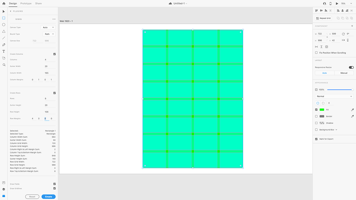
Gridnik was the main tool I used to produce the initial grid compositions. Overall I think it’s great for prototyping grid compositions quickly, and I hope you try it once it releases on the XD Plugin Manager!
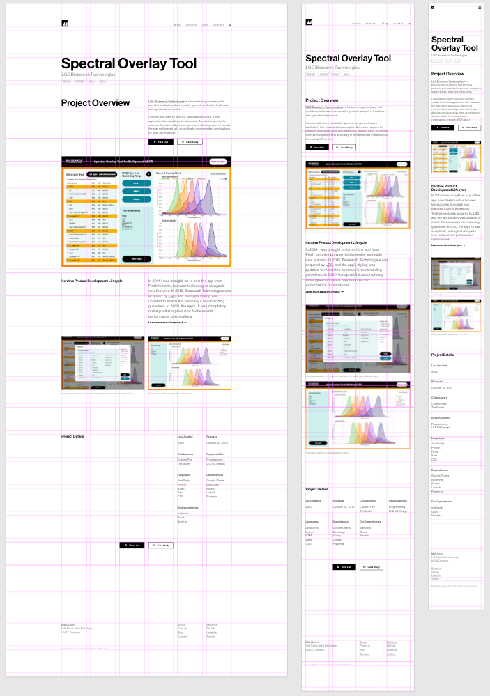
Developing Layouts with CSS Grid
After reading Grid Systems in Graphic Design by Josef Müller-Brockmann and the Vignelli Canon by Massimo Vignelli, I was inspired to apply the Swiss grid methodology to the CSS grid. Unfortunately, the implementation process was difficult for me due to my previous experience and expectations with grids.
First of all, this was my first time learning something technical coming from an existing design background. (Usually it’s the other way around.) My previous experience with building Swiss grids in some ways worked against me initially, as my idea of what a grid should be conflicted with a lot of the CSS grid specification.
Another issue was that I hadn’t learned CSS grid yet, and I didn’t realize beforehand that significant portions of my layout composition would rely on solutions best solved with CSS subgrid, a feature that is currently unsupported by the majority of browsers. To work around this, I ended up using nested grids to align elements that weren’t direct children of the parent grid, but it came at the cost of much dirtier code.
Aside from those complications, most of the Swiss grid methodology has managed to age extremely well and still holds up to most modern challenges today. With this practice, field widths are determined by the ideal balance between type size and line length. Line height is used to determine the gutter size. Cap height, baseline, and line height are used to align text and media of adjacent fields. Proper margin proportions are set around the grid to produce tension between the edge of the screen and the page content. Following all of this in the digital space still produces a grid with fantastic visual harmony.
However, I learned the hard way that the methodology still needs some adjustments to handle some of the new challenges brought upon by modern technology. The Swiss grid was conceived in a time far before the web where all the content of a page was handpicked and could be perfectly composed statically. Producing a solid grid with varying cell sizes was seen as an advanced problem. On the web, even a reasonably simple website can easily fall into this advanced case, and it would be a nightmare to create a grid using only the tools and techniques the Swiss designers had during their time. CSS grid, luckily, was built to solve the problems of the present-day.
The first modern solution CSS grid provides is an auto cell. This basically allows the cell to stretch to the size of its inner content. While this seems like a no brainer to have, from a traditional Swiss designer’s perspective it’s actually a foreign concept. The entire Swiss grid philosophy relies on knowing that the grid will handle a set amount of content with a set amount of content type variations. However, the expectations for the content have heightened drastically through the complexity of modern-day applications, so while some Swiss designers would’ve seen the use of auto cells as poor and lazy design, today auto cells are absolutely necessary to handle the incredible lengths and diversity in content.
As I was porting over the grids I designed in XD to code, I would run into scenarios where I realized that a template’s grid was too specifically built for a small range of content length or type. Sometimes it was indeed a sign that the grid did need a rework, but other times I realized that auto cells were the solution. The danger with auto cells is that it is easy for the cell to feel out of place, so some rationale needs to be established to make it consistent with the entire grid. In my case, because the grid composition was rooted in the typography, all I needed to do was make sure the rules of typography (font size, line height, alignment, words per line, etc.) were preserved to make it feel like everything fit together.
One nightmare for Swiss grids is responsive design. Swiss designers did experiment with the grid a lot, even applying it to a 3D space, but they never thought about a grid that allowed its viewer to stretch or squeeze it as they pleased while keeping content on it legible.
There are a few ways CSS grid can handle this, but one common pattern I ended up using involved use of the repeat function, minmax function, and fr unit:
.grid {
  display: grid;
  grid-template-columns: repeat(auto-fill, minmax(200px, 1fr));
}
auto-fill tells the browser to create as many columns as possible as it can within its parent container, all while keeping each column width greater than or equal to 200 pixels or less than or equal to 1 fr unit. 1 fr unit is the equivalent to one subdivision of the total space of the grid, so for example, if there are 6 columns of the grid, 1fr would be the equivalent of ⅙ of the grid, 3fr would be ½ of the grid, etc. This allows the grid to adjust the column widths and column amount as the screen resizes. Of course, the same can be done for rows.
Overall I am satisfied with the final composition, but I can see a lot of room for improvement in both design and technical implementation. Despite all the problems I had with it during this project, CSS grid will definitely be my layout solution of choice from now on. It took quite the shift in mindset transitioning from float-based layouts, but after learning CSS grid I now wonder how we’ve been building layouts without a true grid solution for so long. (I guess tables were the closest thing, but they don’t count!🤮) I look forward to another CSS grid project, as next time I’ll be able to go into it with a solid understanding of the CSS grid specification and grid design theory from the get-go.
Designing Inclusive & Accessible Experiences
Making the project accessible through keyboard and screen reader support was an enlightening experience for me. I never had the opportunity to really focus on accessibility (a11y) before, and I wish I had done it earlier. Researching the different options, experiences, and preferences people have when navigating the web has completely changed the way I think about user experience.
A significant amount of a11y can be covered just by using HTML semantics and structuring properly, so I made the effort to use HTML5 semantic elements when possible instead of blindly putting everything into a div. I also made sure to set aria-label and aria-labelledby values when beneficial.
After reading the results of Heydon Pickering’s screen reader strategy survey, I learned that navigating through headings was a very popular way of navigation for screen reader users. To accommodate for this, I made sure every important landmark had a heading associated with it. Visually though, some landmarks do not have a visible heading, like the main navigation, as adding one would clutter the visual composition too much. To address this issue, the headings for these cases are positioned offscreen so that they are still accessible by screen readers but are not a visual part of the UI.
One problem arises from the SPA nature of the website. Because page navigation is done without page reloads, screen readers have no way of knowing when a new page is actually loaded. To correct this, the main page heading is focused automatically whenever navigation occurs.
Another problem deals with the modal component being used in the footer of the site. Because there isn’t a widely supported native solution for modals, I implemented one while following WAI-ARIA Authoring Practices. Despite using many modals, it never occurred to me how it was possible to tab through elements behind an open one before. The solution is to build a keyboard trap that prevents this from happening. The modal now is available as a component in eswiss’s component library.
There are definitely more a11y improvements I could add such as including a skip navigation link, increasing touch target sizes, and improving color contrast ratio, but I’ll try to implement them in an update later on. They will definitely be design aspects I will consider from the start of my next projects from now on.
Animating with Framer Motion
Because the overall style of the website is minimal, animations play a very significant role in polishing the UX and making the website feel sleek. My previous React projects relied on react-transition-group for animations, but the package is a bit too much to work with since it’s not actually an animation library. That’s why it was important for me to find a declarative animation library that worked well with React and React Router. I eventually settled on Framer Motion, and I have to say it really made animations a cinch!
The hallmark animation of the project is what I call a blind animation, like a window blind you pull up. The content initially starts hidden behind a closed blind. When the blind opens, it moves upward and uncovers the content. It’s a very simple animation, but it’s a classic one that is common in a lot of motion design work that is inspired by modernist typography.
import React from "react";
import { motion } from "framer-motion";

/**
 * Blind Animation
 * Must be used within a BlindFrame component
 * @prop {number} [delay] Delay in seconds
 * @prop {number} [duration=0.4] Duration in seconds
 * @prop {Object} [observer] Used to disconnect observer after animation is complete
 * @prop {boolean} [play] Flag that controls if animation is played
 */
const Blind = ({ delay, duration, observer, play }) => {
  if (!duration && duration !== 0) duration = 0.4;

  const VARIANTS = {
    animate: (custom) => ({
      height: "0%",
      transition: {
        delay: custom,
        duration,
        ease: "easeOut",
      },
    }),
    initial: { height: "100%" },
  };

  const animate = play ? "animate" : "initial";

  return (
    <motion.span
      animate={animate}
      aria-hidden={true}
      custom={delay}
      initial="initial"
      variants={VARIANTS}
      onAnimationComplete={() => {
        if (observer) observer.disconnect();
      }}
      className="blind"
    />
  );
};

/**
 * Blind Frame
 * Frame used for positioning blind animation
 * @prop {children} [children] Children
 * @prop {number} [delay] Delay in seconds
 * @prop {number} [duration] Duration in seconds
 * @prop {Object} [observer] Used to disconnect observer after animation is complete
 * @prop {boolean} [play] Flag that controls if animation is played
 */
const BlindFrame = ({ children, delay, duration, observer, play }) => {
  return (
    <div className="blind-frame">
      <Blind
        delay={delay}
        duration={duration}
        observer={observer}
        play={play}
      />
      {children}
    </div>
  );
};

export default BlindFrame;
.blind-frame {
display: block;
position: relative;
}
.blind-frame > .blind {
background-color: blue;
display: block;
height: 100%;
position: absolute;
width: 100%;
z-index: 1;
transition: background-color 1s ease-out;
}The BlindFrame component holds the Blind component and the content. The BlindFrame is positioned relative so the Blind inside of it can be positioned absolute and fill the entire space of the BlindFrame. To get the animation to play, the play prop needs to be set to true. Once the animation starts, it transitions the height of the Blind from 100% to 0%, thus revealing the content underneath it. To make sure that the animation is only played when a user can see it, the blinds are attached with intersection observers that set play prop to true when the blind is visible in the viewport.
Closing Remarks
This project taught me a ton, and I hope that you found this case study informative. Maybe some of these examples can help or inspire you in your own work. All of the examples in this post are quite simplified when compared to the actual implementations, so if you want to see the exact implementation details used for this project, you can check out the GitHub repository.