Case Study:Spectral Overlay Tool
Building a biotech data visualization tool.
· 5 min read
- Case Study
- Design
- Frontend
- Tooling
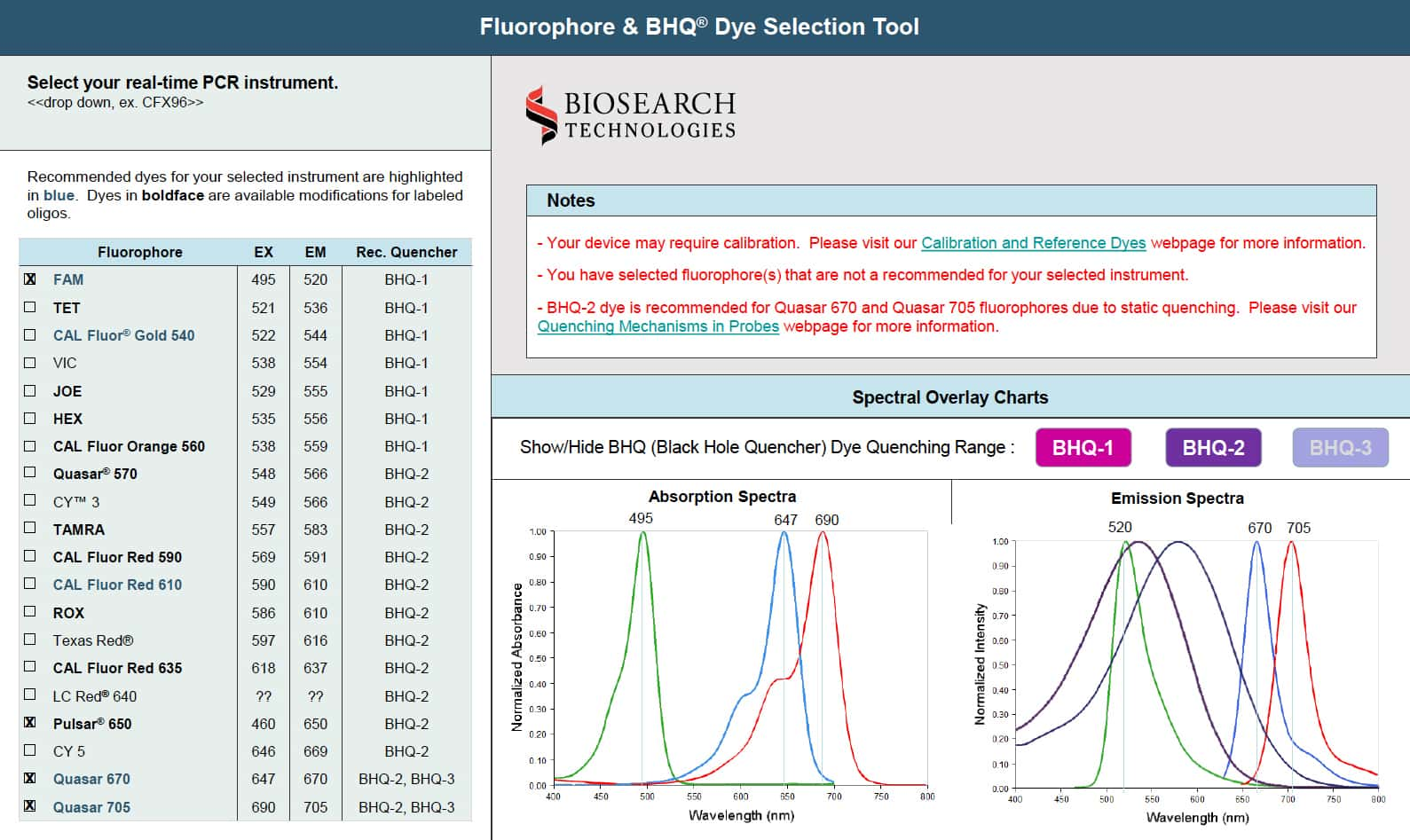
Modernizing a Visualization Tool
In 2014, Biosearch Technologies approached me to redesign and develop their interactive selection tool called spectral overlay tool. This application helped scientists select the right parameters needed to design an assay for a common molecular biology method known as quantitative Polymerase Chain Reaction (qPCR). For the company, this was a critical buyer enablement tool used to streamline conversions into sales.
The original tool needed a user experience overhaul and used Flash, so to improve its usability and longevity, Biosearch Technologies recognized that they would need the tool updated and ported to work natively in the browser.
They also had plans to launch the qPCR Design Lab, a microsite that offered various resources and tools about qPCR targeted to both new and experienced users. The spectral overlay tool would be one of the primary tools to be featured on the site.
The tool has received periodic updates after its initial release. Unfortunately, the microsite it was originally found on is no longer online, but the tool can still be found on the LGC Biosearch Technologies website.
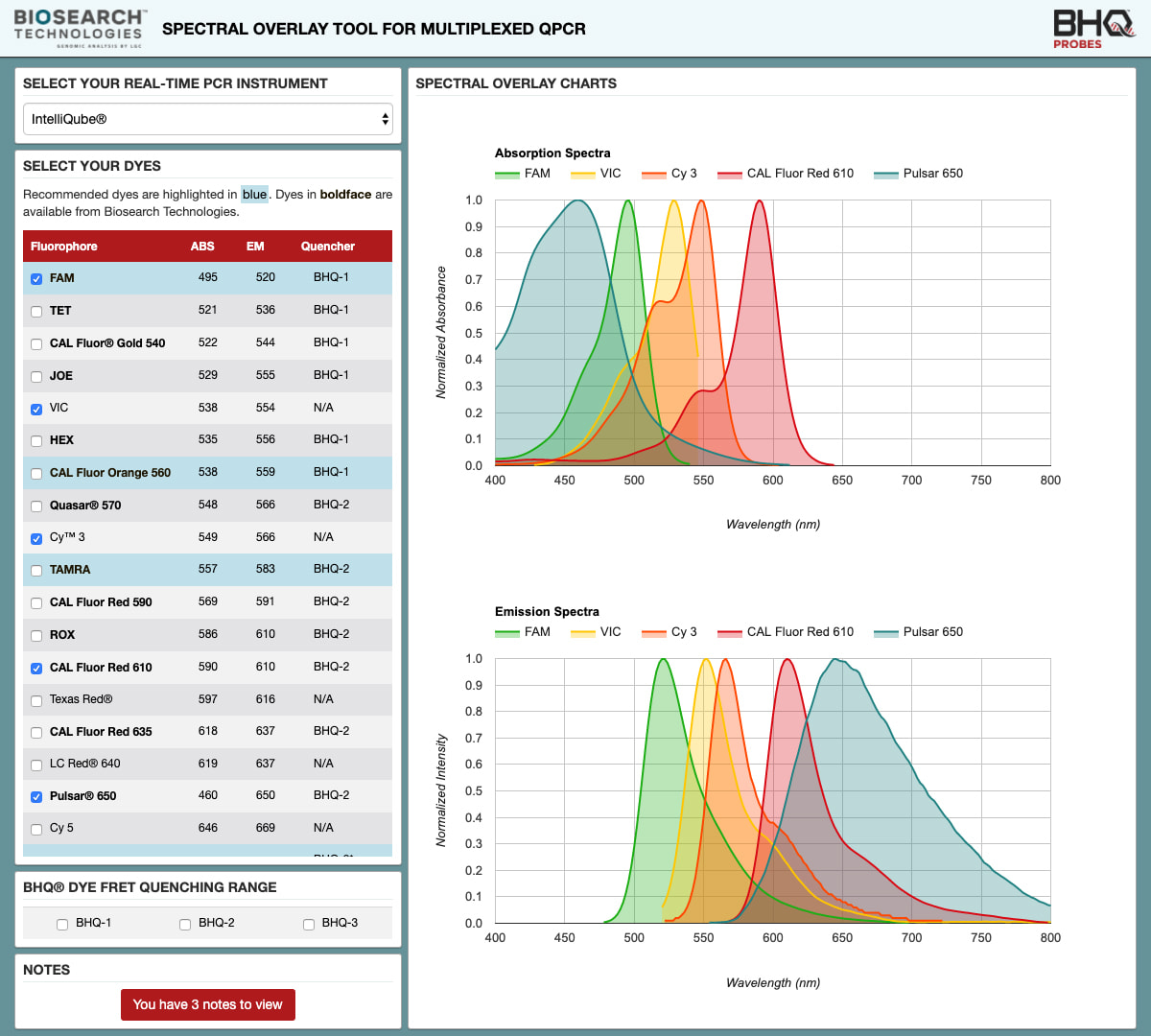
Initial 2014 Version
Early Design Progression
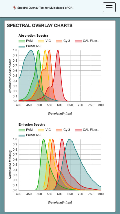
Biosearch Technology’s marketing team and I designed the initial wireframes and wireflows together. This design supported both desktop and mobile devices. We then quickly iterated through several prototypes of the application until we settled on the finalized layout.
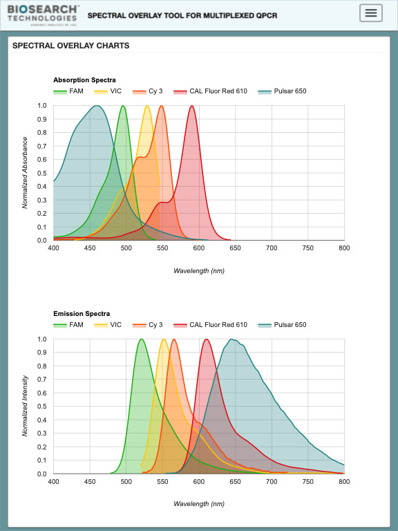
In 2015, Biosearch Technologies was acquired by LGC. Because of this, they reapproached me to perform some visual design updates that incorporated their new branding guidelines.
Settling on a Technology Stack
I chose to use Bootstrap for its excellent cross-browser compatibility, modal component, and great reliability. Because the framework was already dependent on jQuery, I decided to use that for the rest of the application too. I also used Sass to utilize its powerful features to improve the maintainability of the style codebase. For the charts, I ended up choosing Google Charts because it supported area charts and had clear documentation.
Custom Layout vs. Bootstrap Grid
At first, I built the layout with Bootstrap’s grid system to quickly iterate through the first few prototypes, but we realized that it was important to maximize the amount of space the data visualizations took, especially on mobile devices. This wouldn’t work well with the default dimensions defined by Bootstrap’s grids, so I implemented a custom float layout built with custom media queries to have complete control.
Project Tooling
As I wanted to try out some new things in my workflow, I took the opportunity to use Yeoman for the first time. This introduced me to Grunt which increased my productivity significantly by automatically handling auto-refreshes in response to codebase updates, compiling Sass to CSS, and linting JavaScript with JSHint. It also generated optimized production builds by reducing file sizes through minification with UglifyJS, clean-css, HTMLMinifier, and imagemin.
Because I received all of the visualizations’ data points in an Excel spreadsheet, I wrote a custom command-line interface (CLI) tool in Python to convert them into a JSON format that could be imported into the application.
2020 Redesign
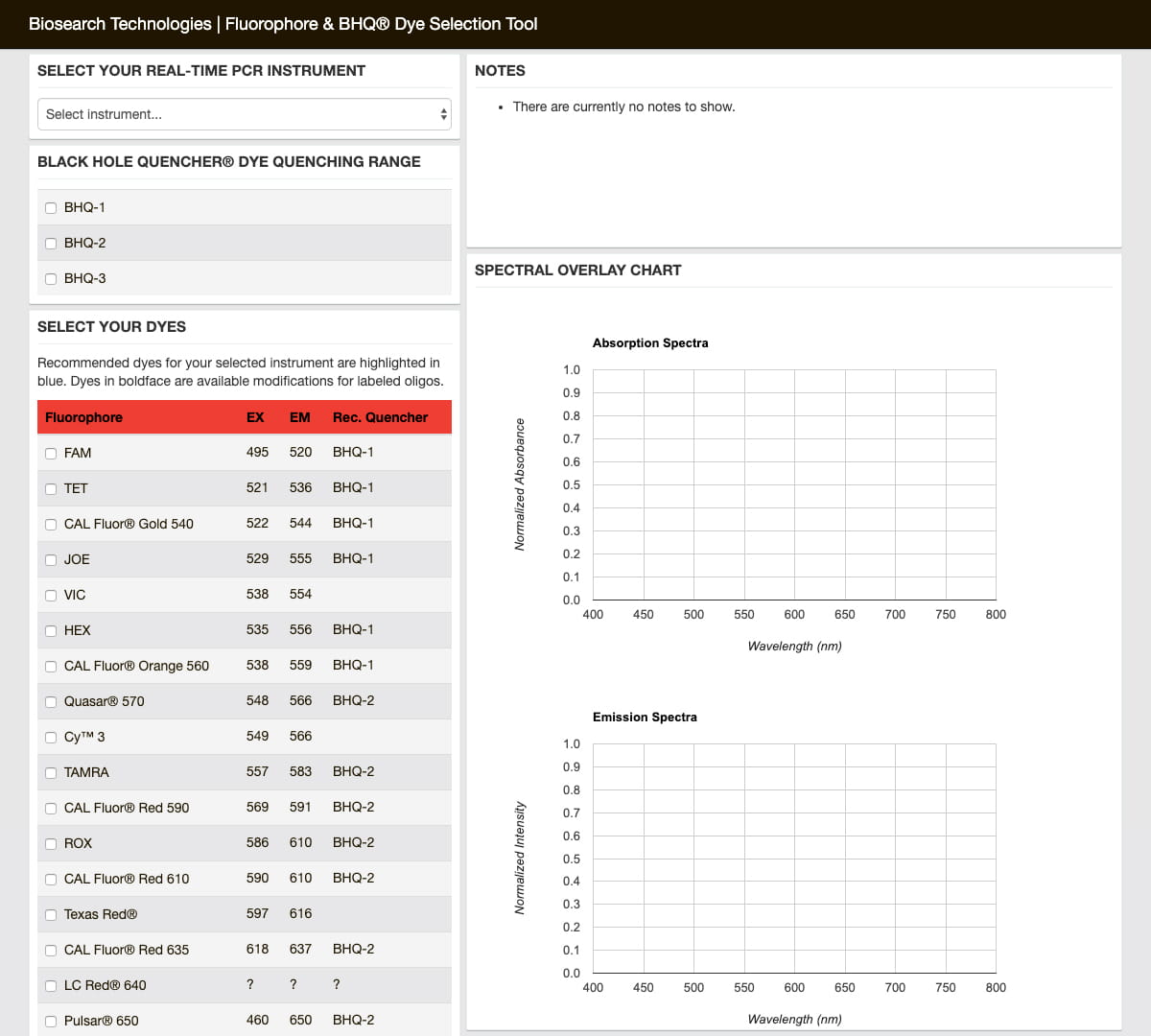
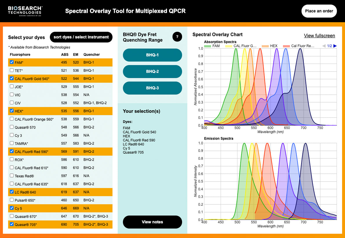
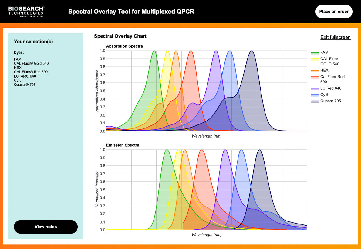
In 2019, the company asked me to perform a complete visual redesign alongside a few new features. During this design iteration, we collaborated with Column Five and built the mockups in XD.
Application Updates
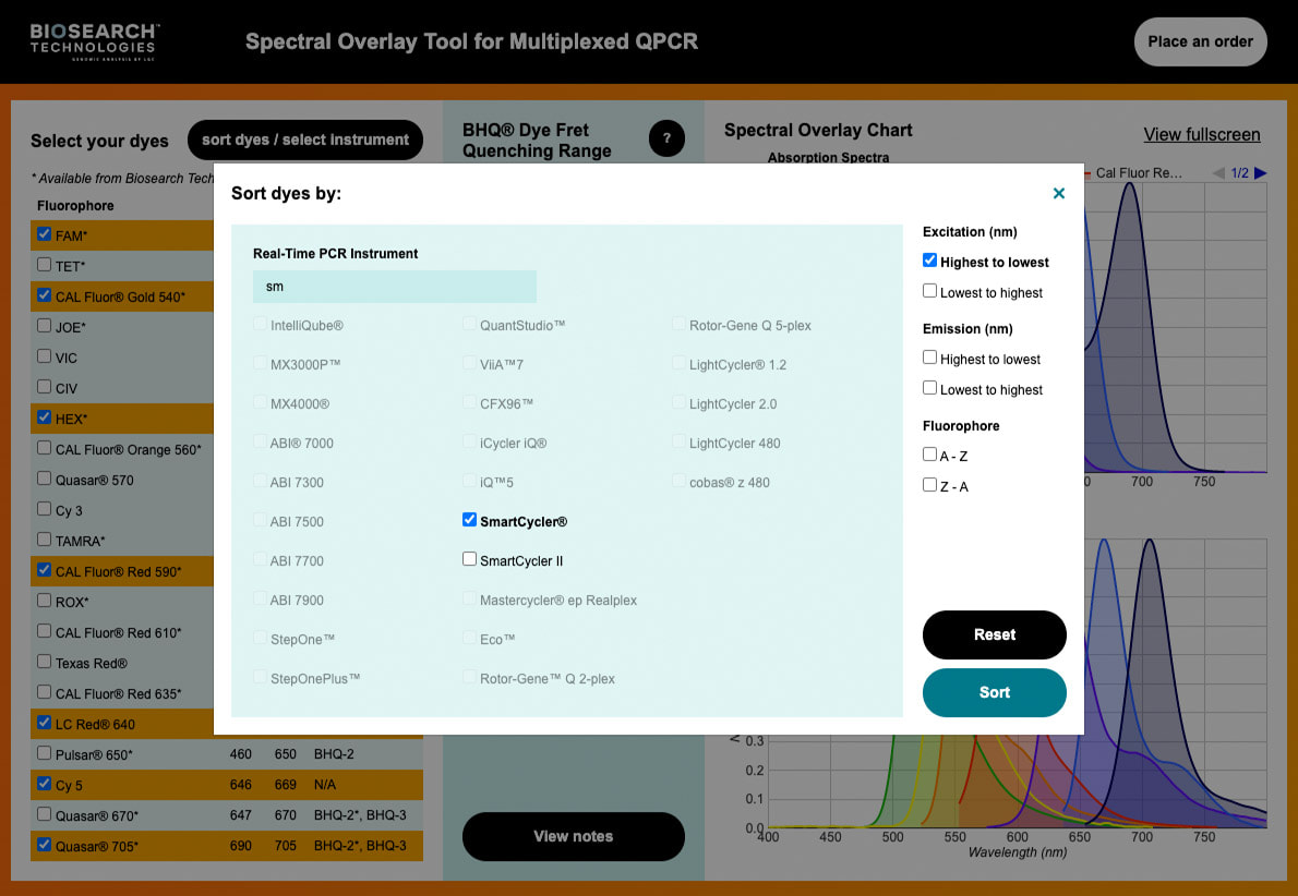
I considered porting the whole application over to a new library like React or Vue, but in the end, the application had been holding up well over the years, so I decided to try to maintain the technology stack and just upgrade and migrate most dependencies to their latest versions. Besides upgrades for dependencies, there were a few new features implemented, the most notable ones being fluorophore dye sorting and instrument filtering. The JavaScript codebase was also updated to use the ECMAScript 2015 specification.
Performance improvements in chart drawing and data handling were also implemented during this time. The most significant one improved the load times for the charts. While the previous versions utilized JSON that was converted with my custom spreadsheet conversion tool, the format of the JSON still required additional transformations before it could be used to render data points with Google Charts. This meant that every time the application started up, it would perform identical transformations to get the data into a readable state. To remove this unnecessary work, the data conversion tool was updated to perform these transformations ahead of time, and this properly formatted data is now statically included within the bundle. That way, whenever the application starts up, it no longer needs to perform any transformations during runtime and it simply feeds the data directly into the Google Charts API.
The styles were also completely rewritten to adopt the Block Element Modifier (BEM) methodology to improve the readability and maintainability of the Sass codebase. Due to a requirement to continue support for Internet Explorer 11, a float-based layout solution was still used over a grid-based one.
Project Tooling Updates
I replaced the old project tooling setup in favor of my own custom webpack configuration based on Lean JavaScript Application Starter. It handles the same responsibilities the previous Grunt-based one had, except it does it all better.
To handle the new ES2015 syntax, webpack now compiles JavaScript with Babel. The code is now linted with ESLint and stylelint. Prettier now handles all formatting to keep the coding style consistent.
The most impactful aspect of the new tooling setup is how it handles the production build process. webpack bundles all related source files together, improving the initial page load performance by reducing the required amount of network requests necessary for downloading the application. It also significantly reduces the overall file size of the JavaScript and CSS by removing unused code through tree shaking and PurgeCSS and minifying with Terser and cssnano. The result of this reduces the overall application file size to the point where it is actually smaller than the older Grunt builds, even though the application has more features than it has ever had. To prevent stale browser cache hits, unique hashes were introduced to the build’s file names to ensure cache invalidation when new versions are deployed.
The custom spreadsheet conversion CLI tool was also rewritten in JavaScript and Node.js, just to keep the entire codebase consistent in one language.
Reception
The spectral overlay tool first went live alongside the qPCR Design Lab on October 23, 2014. Genetic Engineering & Biotechnology News (GEN) awarded the project Best of Web in vol. 35, no. 4.
The 2020 version of the tool went live on the LGC Biosearch Technologies website on September 1, 2020.